What color wallpaper to choose for the bedroom?
Color is one of the main criteria when choosing wallpaper for any room. The mood of the owners will depend on the choice of colors, because an incorrectly selected color will quickly begin to annoy. This is especially true of the bedroom, where people relax and spend a lot of free time. The choice of color for this room should be the most careful.
Neutral colors
Warm and cold neutral colors have always been considered the ideal choice for the bedroom. After a hard day, you want to relax, and you should start the day in a calm mood. The color scheme of calm shades contributes to this in the best possible way. Here are some of the tones you can apply to your bedroom.
- Cold white color is rarely used for wallpaper. It reflects the sun's rays, and in the morning it is not very convenient. A more interesting solution would be to choose an ivory wallpaper. Cream options are also in great demand.
In addition to them, designers can offer such shades of white as marshmallow, "dancing cloud", white lily.
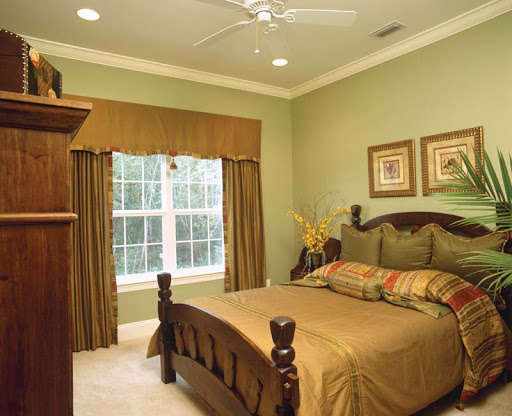
- Pastel colors look fashionable and modern. Out of competition, beige and its varieties. Almond and marzipan, apricot, the color of winter wheat, champagne, ginger look great in the interior of the bedroom. Sand, apple, peach shades are no less in demand. If you like coffee, then you should take a closer look at such colors as coffee with milk, cappuccino. They will help you to cheer up in the morning.
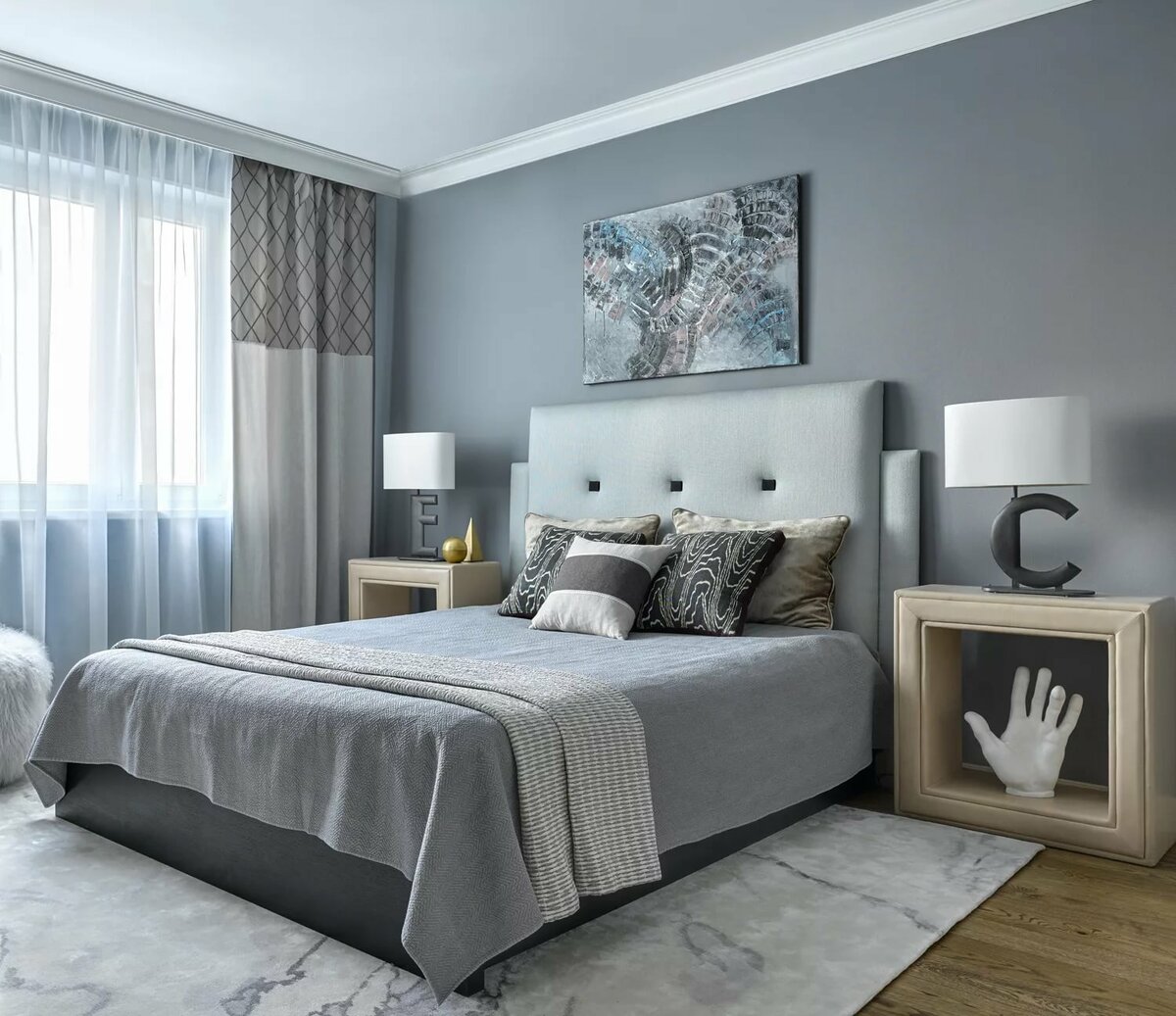
- Light gray has recently become very popular. It allows bedrooms to look discreet but luxurious at the same time. Most often, the color of a rainy day is chosen, silver-gray, gray, ash, pigeon's wing. Shades of gray opal and drizzle, the color of a shower, look amazing. The gray palette is very extensive, and you can always choose something from it.

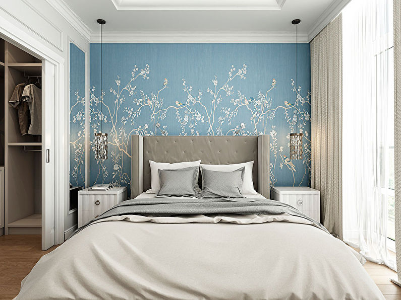
- A neutral terracotta shade can also be a good option for bedrooms. It is best to choose its light options - pale and medium terracotta. If you don't like this color, you can take a closer look at the light olive tones. Continuing the theme of natural shades, it is worth mentioning the heavenly blue tone, which will perfectly fit into any bedroom.
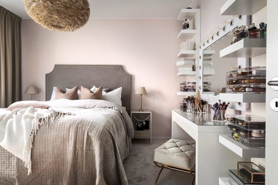
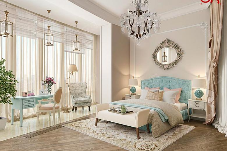
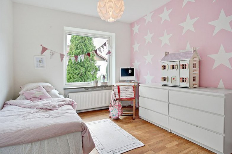
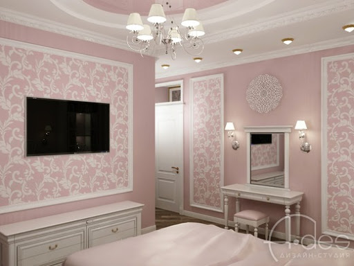
- Matrimonial and girlish bedrooms can always be decorated in powdery shades. The most common are powdery gray and powdery pink.
With such wall decoration, it will be very easy to pick up furniture and accessories, and the bedroom will acquire a romantic and soulful look.
Dark tones
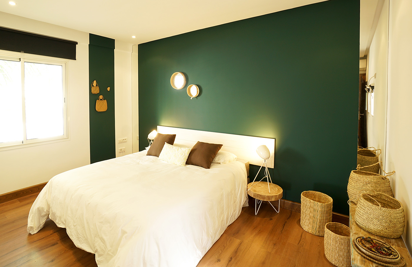
Many people still believe that dark shades are completely out of place in bedrooms. There is a grain of truth in this, since the dark, however, is able to look gloomy. If used incorrectly, it visually reduces the room, lowers the ceiling. But if you choose the right shade, diluting it with lighter colors and adding high-quality lighting, then such a bedroom will look simply luxurious.
Mostly designers use certain dark shades.
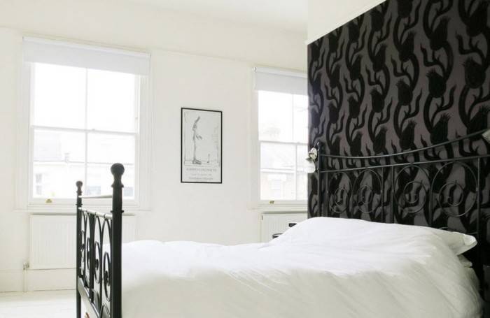
- Black. Deep black is always a mystery. Wallpapers of this shade will look unusual and unique. You need to combine them with light colors: pastel, pinkish, ivory and others. Black and silver looks very elegant.
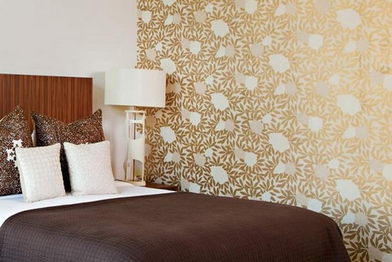
- Dark shades of brown. Wenge, dark walnut and chestnut - all these tones are also applicable in the interior of the bedroom. On a subconscious level, they evoke an association with stability, prosperity, and reliability.The transitions of brown from light to dark (gradient) look especially interesting.
Coffee and chocolate colors are ideally combined with whites and milky. If the interior is classic, gilding will also be appropriate.
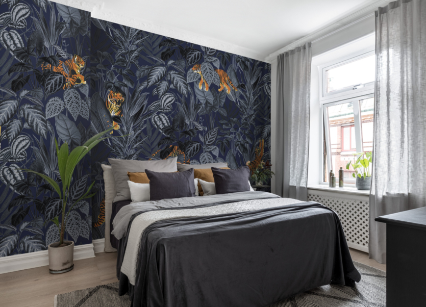
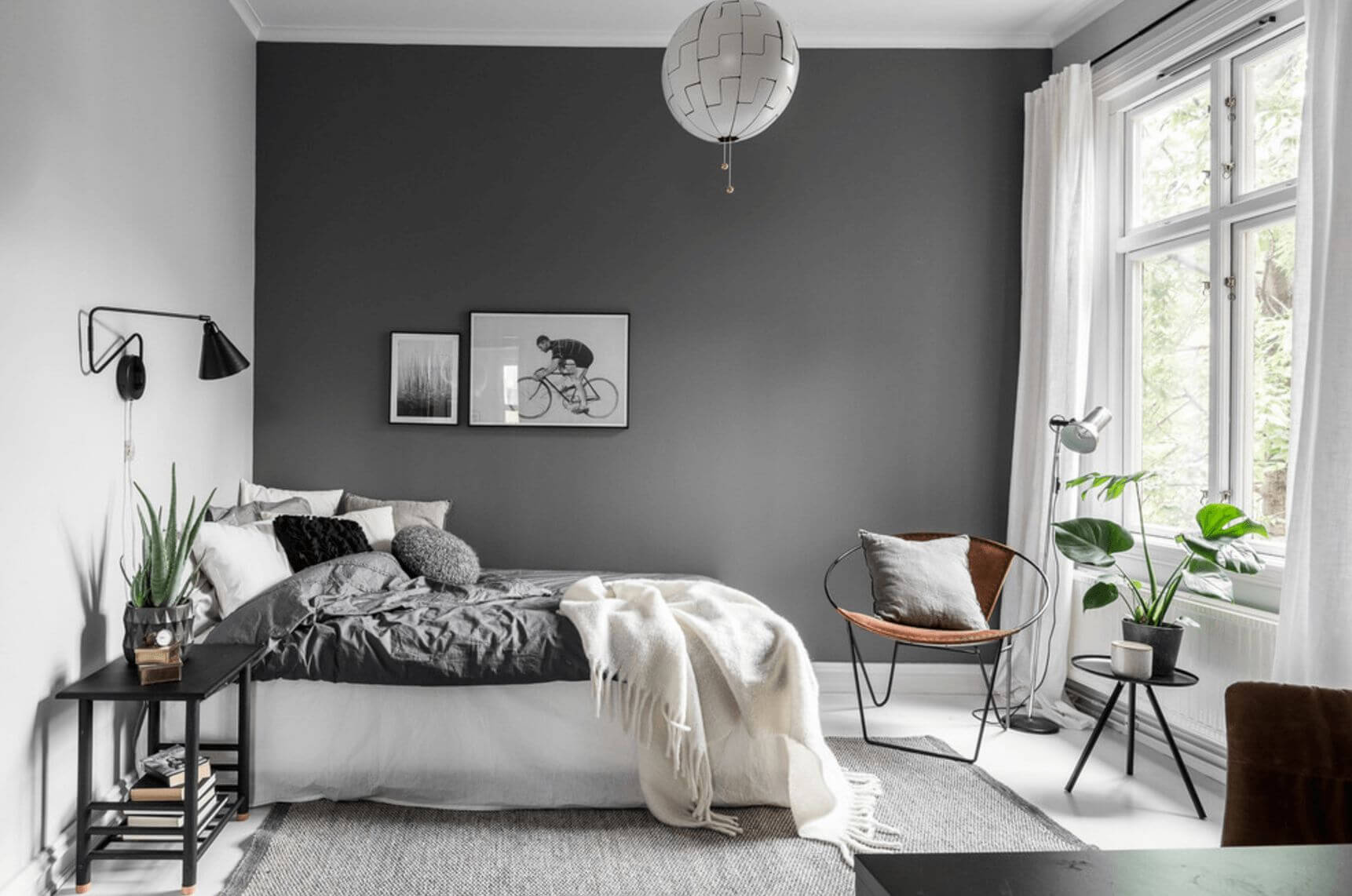
- Other. There are many more other dark colors to choose from for your bedroom. For example, a dark gray palette: anthracite, slate, stormy sky. Dark blue is not far behind in popularity: cobalt, black-blue, Prussian blue, blueberry. From the red palette, you can choose mahogany, merlot, wine tone. From purple - the color of grapes, eggplant, dark purple.
When choosing wallpapers of similar colors, it is recommended to remember two principles of their use.
- Contrast principle. If a completely dark color is chosen, for example, black, then it is unreasonable to paste over all the walls with it. It is better to make one accent, for example, behind the head of the bed or on the side. An accent wall will allow you to emphasize something: a fireplace, an elegant mirror, a beautiful picture.
- The 3-color principle. This is one of the favorite life hacks among designers. It consists in using no more than 3 colors in the interior: dark (about a quarter), light (most of it). The third color is bright, used only for accessories.
Bright colors
With bright colors in the interior of the bedroom, you also need to be careful. If the color is not chosen correctly, it can cause overexcitation, irritation, headache. Consider the shades that will be appropriate in the interiors of the bedrooms.
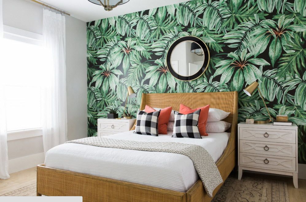
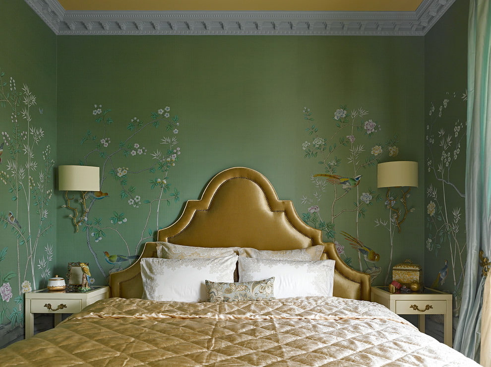
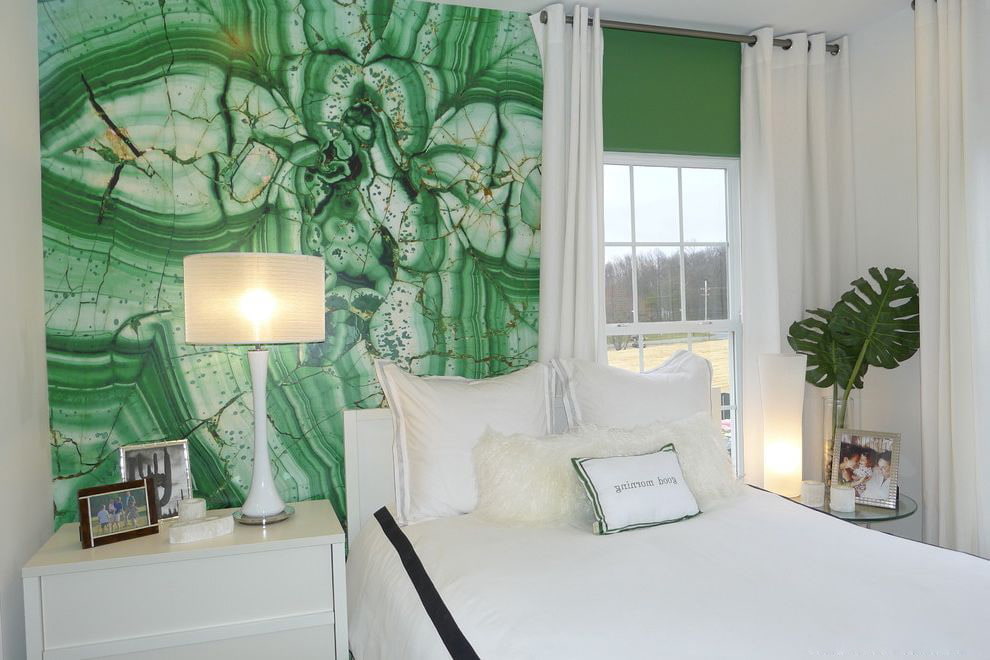
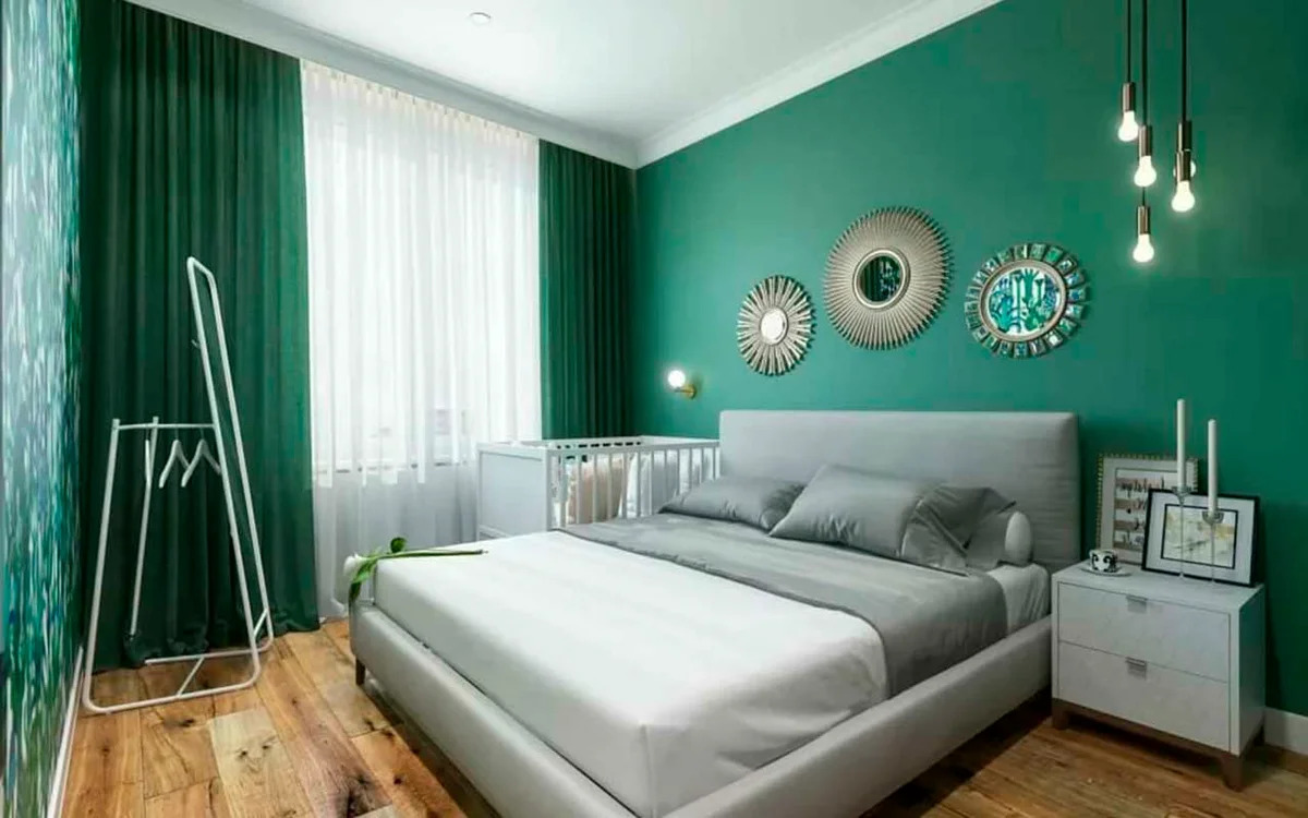
Green
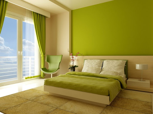
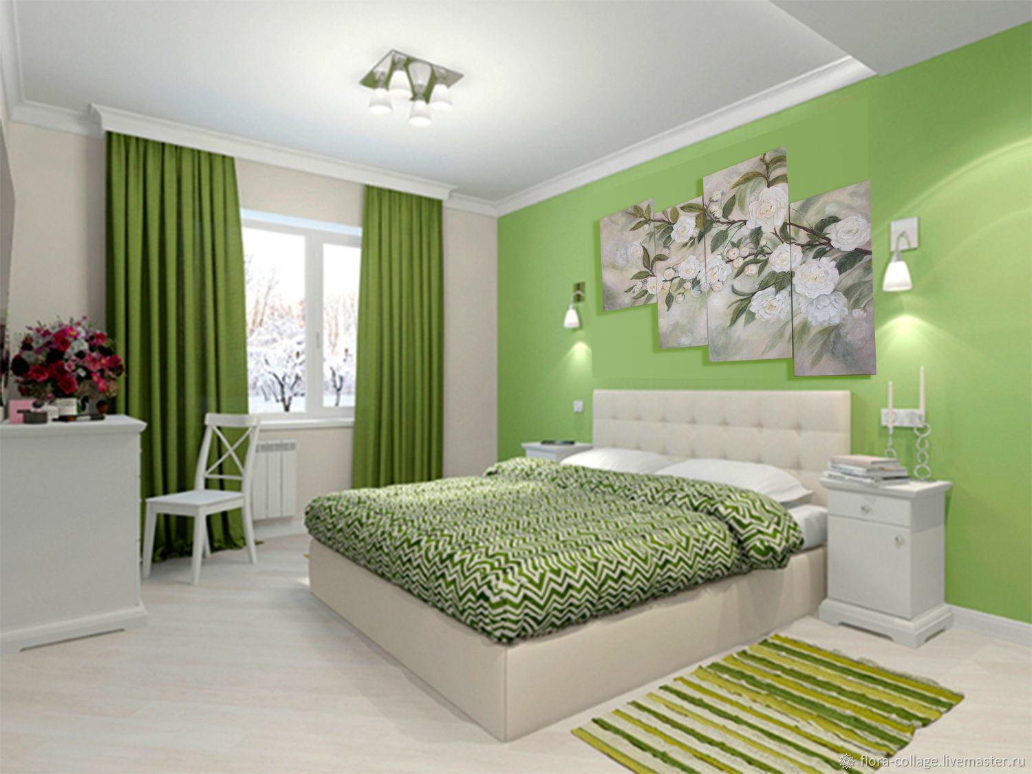
Green color evokes peace and tranquility. This is a natural shade, and we see it every day in foliage, grass, trees. But it is worth remembering that not all green tones are suitable for rest rooms.
Interesting choices are:
- spring;
- jade;
- sea green;
- light green;
- mint;
- Granny's apple shade;
- pistachio;
- emerald;
- olive.
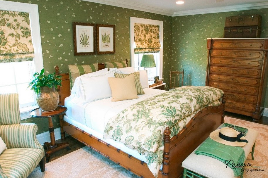
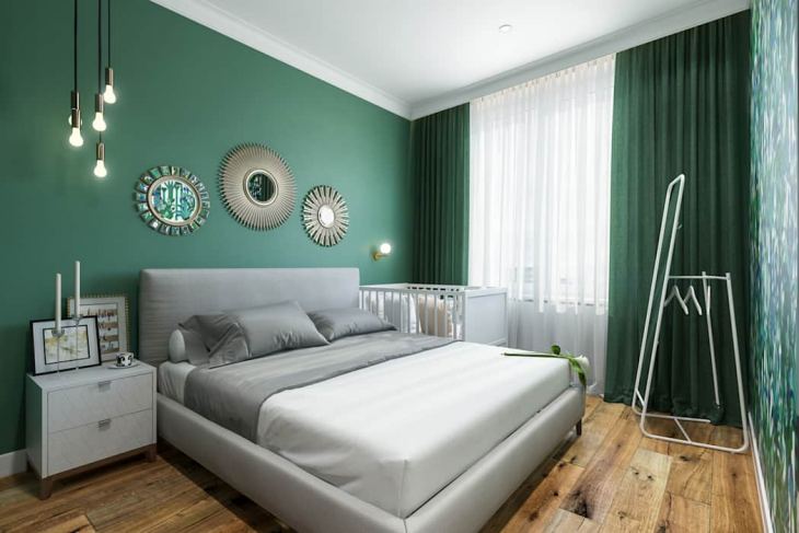
All these tones combine well with light and dark wood furniture. The lighter the color, the darker the furniture can be. Also, plain green wallpaper can be well combined with golden, yellow, white, red.
The following colors will turn out to be too bright:
- green neon;
- lime;
- malachite;
- chartreuse;
- forest green.
These colors can only be used as accents.
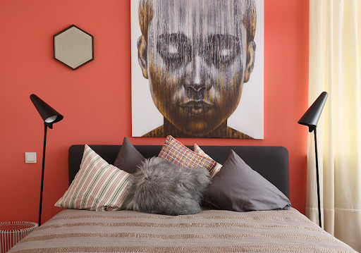
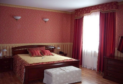
Red
The deep red tone has long been considered a symbol of love and passion. Young couples like to choose this color for their bedrooms. However, in large quantities, it will cause aggression. Too bright, blood-red motifs should be avoided. It is better to choose a more neutral and muted shade, for example:
- salmon;
- begonia color;
- indian red;
- light coral;
- cardinal;
- blush;
- Cherry;
- chestnut red.
Red wallpaper definitely needs to be balanced. The easiest way to do this is to use chocolate colors. In tandem with red, they are great.
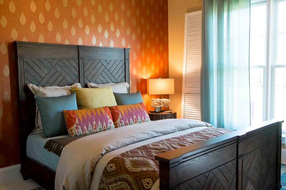
Orange
A bright orange tone in moderation can lift your spirits. This color contributes to the awakening of energy, the desire to start a new day as soon as possible. Workrooms are often decorated with rich and rich colors, but for the bedroom it is worth picking up something interesting, but less bright.
A good choice would be these colors:
- orange peach;
- orange pink;
- apricot;
- ocher;
- bronze;
- honey.
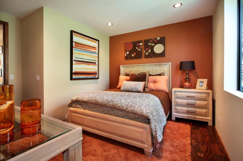
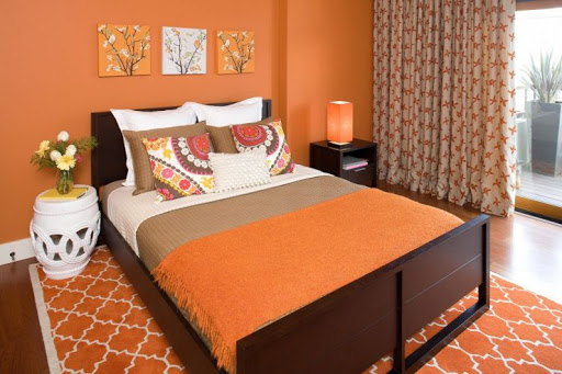
Orange colors go very well with white colors, as well as with steel gloss. This is why they are so often seen in minimalist bedrooms, as well as high-tech rooms.
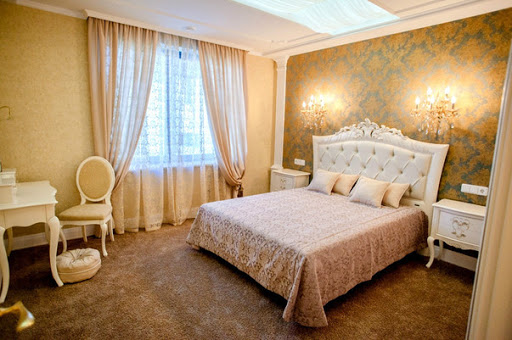
Golden
Gold wallpaper has been used in bedroom decoration for a long time. Most often they can be seen in classic as well as baroque interiors. It is important to note that the golden hue must be muted, otherwise the bedroom will begin to resemble a palace boudoir and will lose its luster. Gold colors should be combined with light curtains, light finishes in the room. It is also worth remembering the patterns on the wallpaper, because golden models are not always monochromatic.
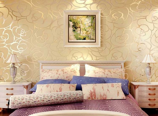
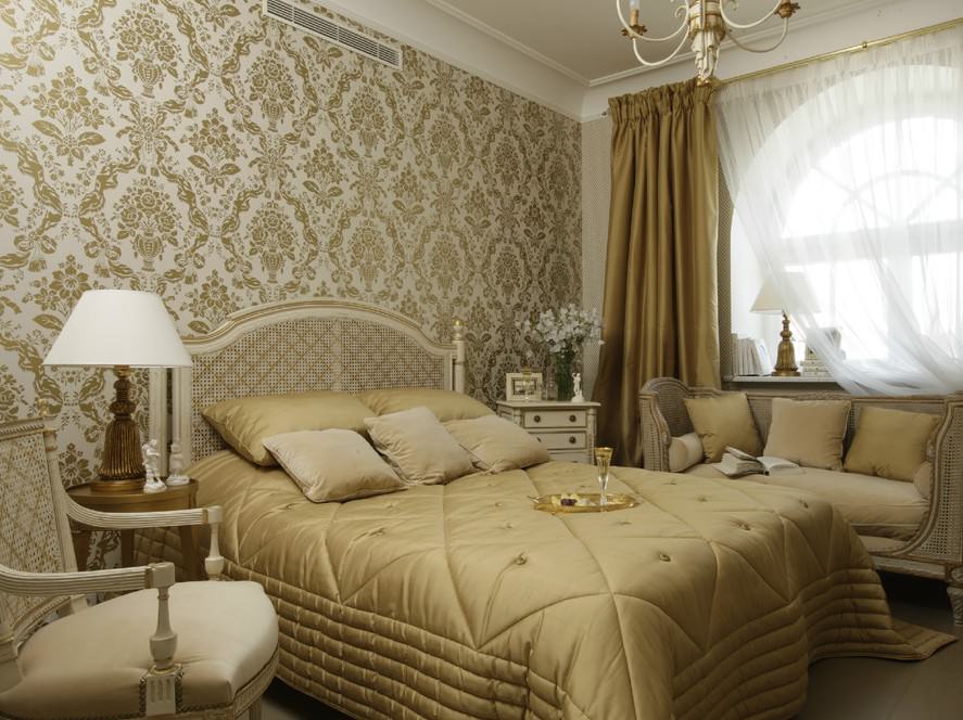
There are several types of drawings for these options.
- Ornament. Vertical stripes can make the bedroom visually longer, while horizontal stripes expand the space.
- Geometry. Light geometric shapes and abstractions are good choices for modern styles. It is important that the curtains are monochromatic.
- Floral print. This pattern will refresh romantic bedrooms.
- Monogram. This pattern will be a great option for classic interior design.
Other
As for other bright shades, you need to pay attention to a few more colors.
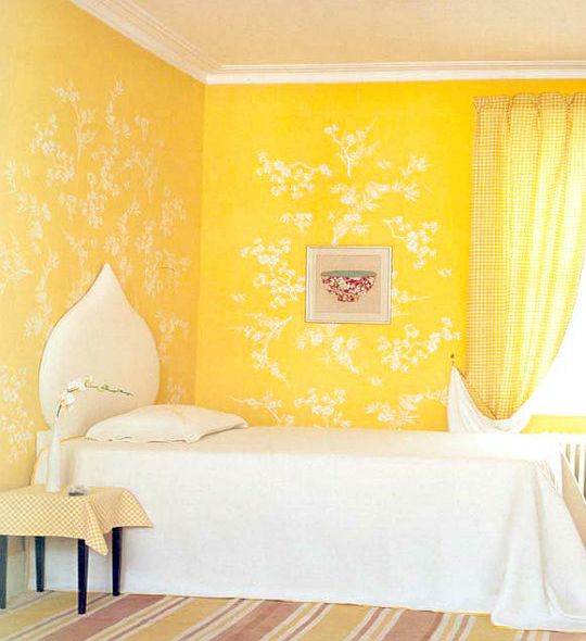
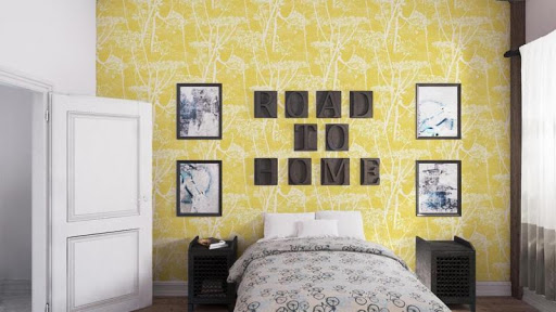
Yellow the color effect is very similar to orange. He is also very invigorating, energizing. In the interior of the bedroom, the following shades of yellow will be appropriate:
- sunny yellow;
- pale yellow;
- banana;
- pear;
- mustard;
- straw;
- golden oak.
Stronger colors such as lemon or canary should only be used on an accent wall or in accessories. Yellow can be combined with black, white, dark gray, light blue and blue colors.
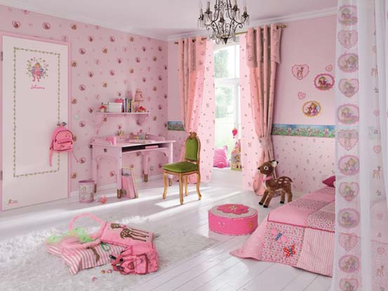
Pink Is a rather ambiguous color. It's best suited for little girls' children's bedrooms, but that doesn't mean picking out flashy, acidic pinks. Here are some acceptable colors:
- Carnation;
- purple;
- pink cherry;
- baby pink;
- Japanese pink;
- lavender pink.
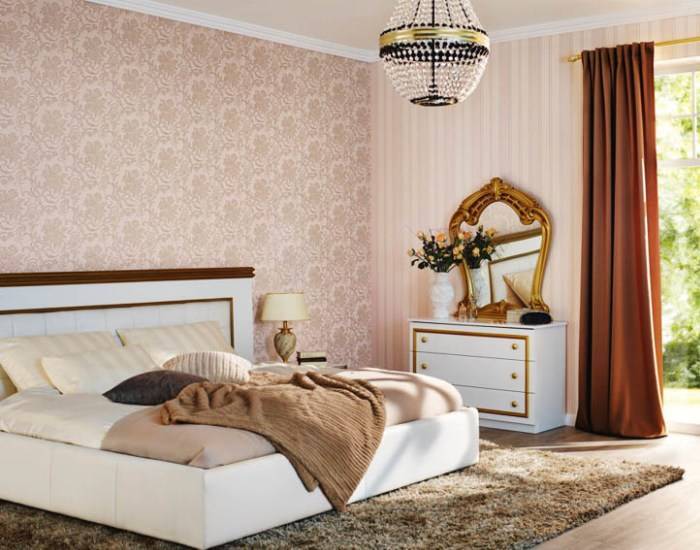
Some shades of the described color are quite suitable for the bedroom of an adult lady, and even for a conjugal rest room. These are the colors:
- white and purple;
- royal pink;
- rose ash;
- beige pink;
- pale pink;
- pastel pink.
Pink colors look spectacular in combination with brown, white and gray tones.
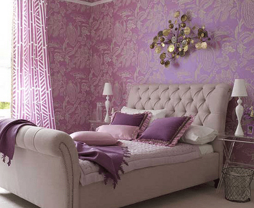
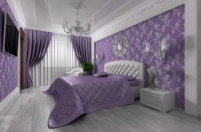
As for the purple tones, the following colors would be an excellent choice:
- lavender;
- amethyst;
- light lilac;
- a shade of wisteria;
- hyacinth.
The rest of the tones may seem too dark or rich. Their abundance is quite capable of causing irritation.
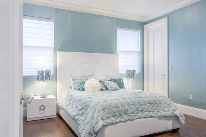
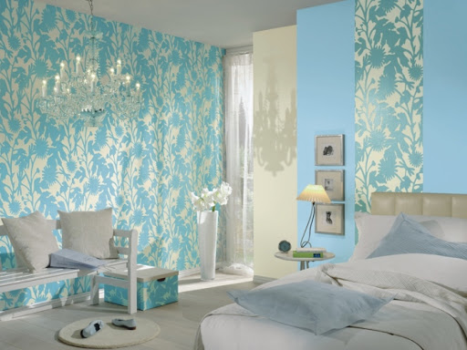
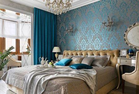
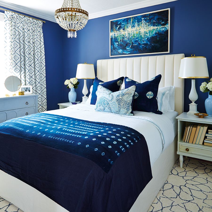
Blue color associated with peace. Like green, it is a natural shade. The following options are often found in wallpaper colors:
- blue;
- Niagara;
- pale cornflower blue;
- heavenly.
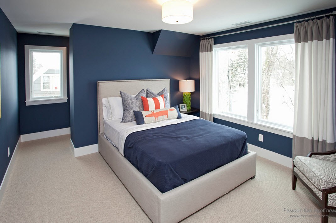
Popular dark blue colors:
- royal blue;
- azure;
- azure gray;
- night blue.
How to choose the right one?
In order for the bedroom to evoke a feeling of peace and a desire for relaxation, you need to choose the right color for the wallpaper. Selection can be carried out using personal intuition and taste, or you can turn to designers. For those who decide to think over the design on their own, it will be useful to familiarize yourself with some important rules.
- Focus on the size of the room. If it is small, it is better to choose wallpaper that expands the space. These are light color options. Shades can be either cold or warm. You can complement the expansion effect with glossy surfaces and mirrors.
- Consider the side of the world. The sunny south or east side is a field for imagination. In such a room, you can glue both dark and light wallpapers. As for the north side, it is better to compensate for the lack of lighting with light wallpaper. Consider the availability of fixtures.
- Pay attention to style. If there is any special style in the room, it must be taken into account. For example, the classics prefers cream, pastel colors, Provence accepts blotches of lilac and pink, and in a loft one cannot do without gray and brick.
- Consider age and character. What works for a teenager may not be appropriate for an older person. But you cannot limit yourself to this, you still need to take into account the character. A calm person will feel comfortable surrounded by neutral tones, but someone who loves movement simply cannot do without bright colors.
If you like everything in the bedroom to correspond to the teachings of feng shui, then you most likely already know everything about the effect of color on the human psyche. According to this teaching, the coloring of the wallpaper should be as relaxing as possible and contribute to a good rest.
When choosing, you cannot follow only one mood, since there is no guarantee that it will not change in half an hour.

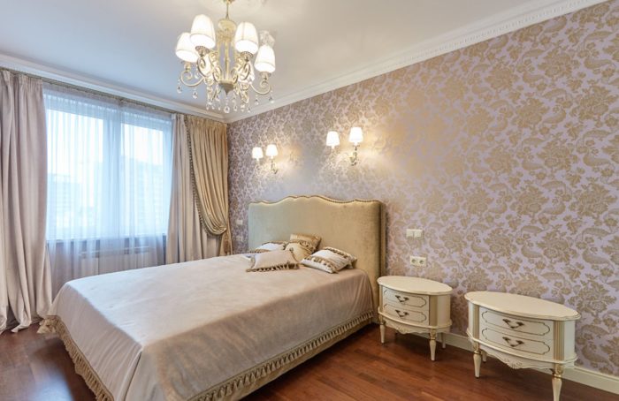
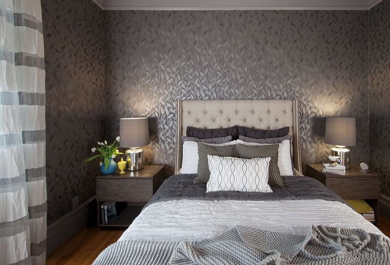
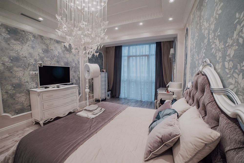
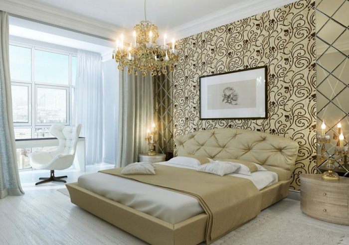
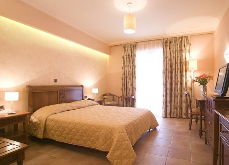
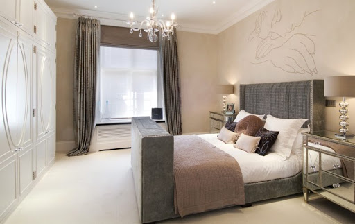
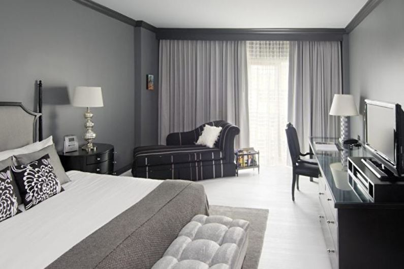
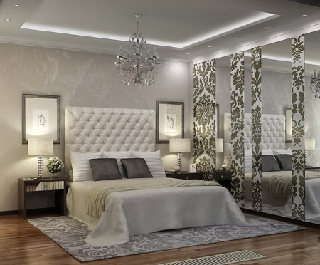
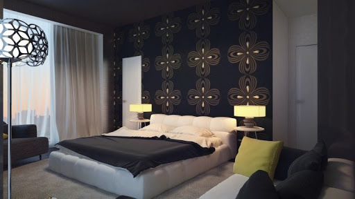
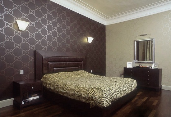
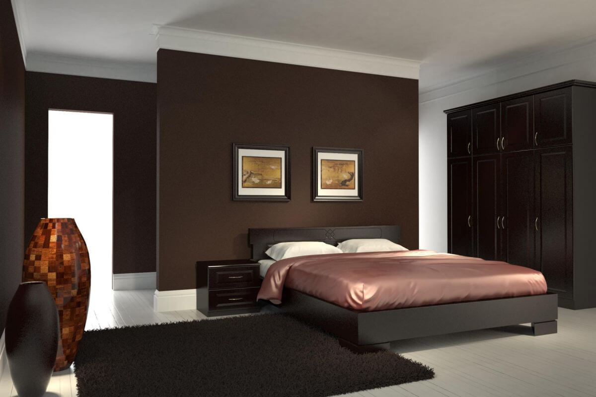
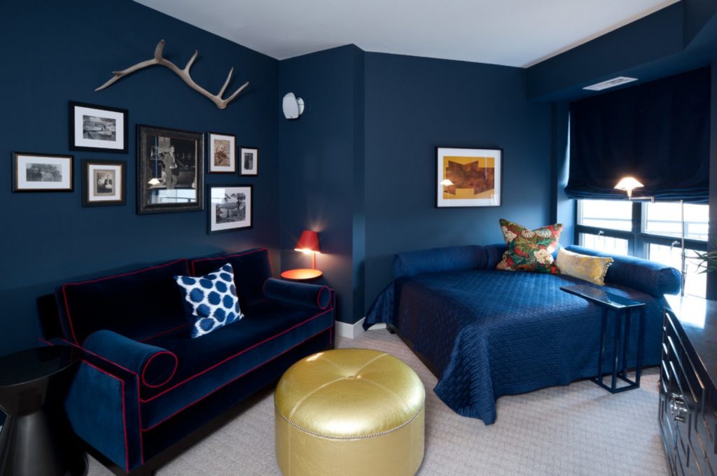
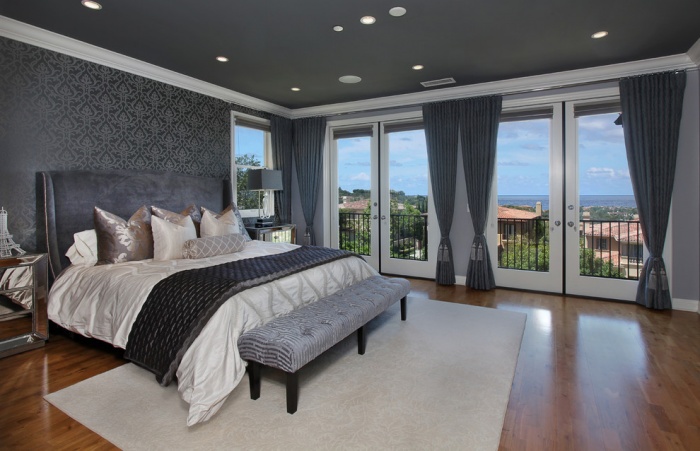
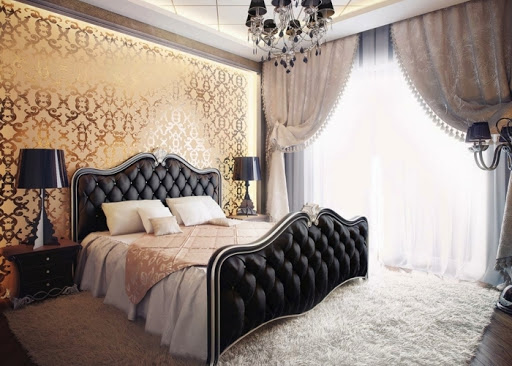
Beautiful examples in the interior
Finally, consider a few photos of successful bedroom interiors.
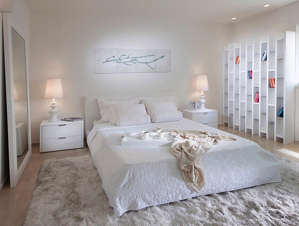
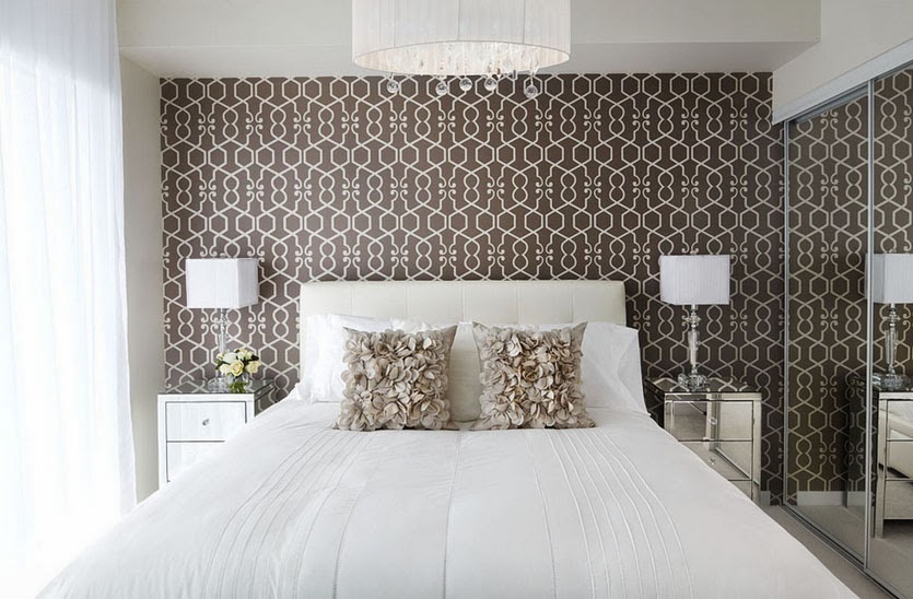
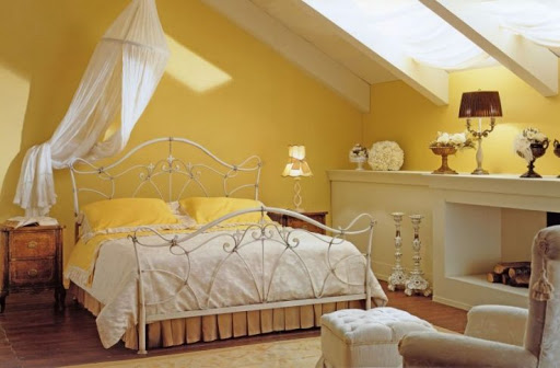
- Beautiful bedroom in light shades. Accessories and furniture harmonize effectively with the color of the walls.
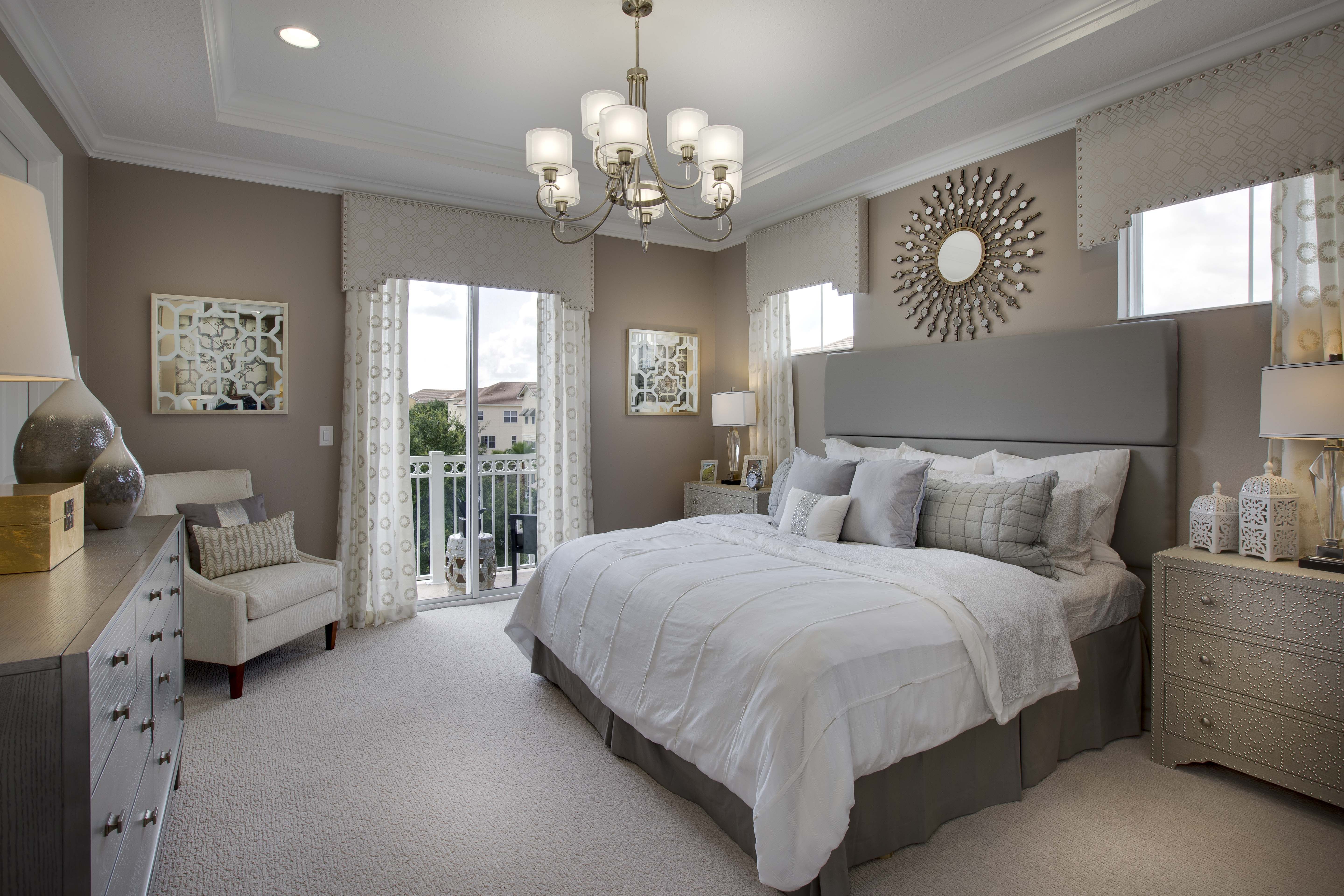
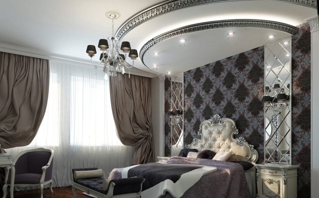
- A classic rest room, the symmetry in the arrangement of the furniture is clearly visible.
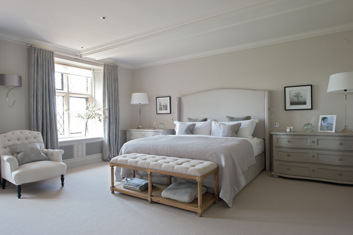
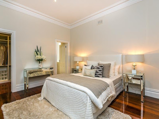
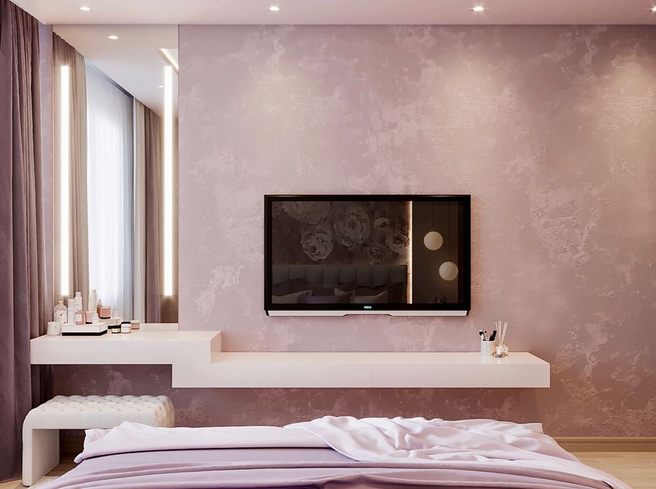
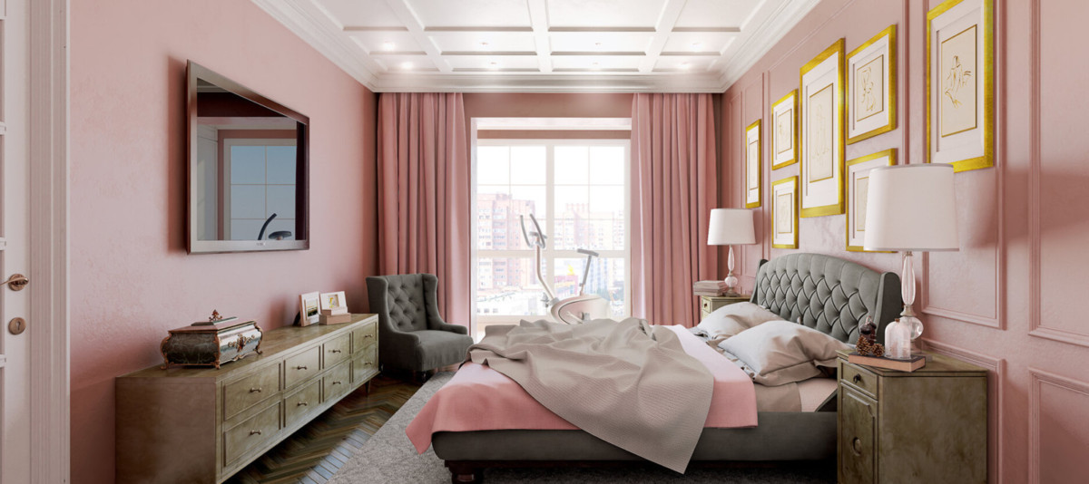
- A neutral powdery bedroom with a chic design.
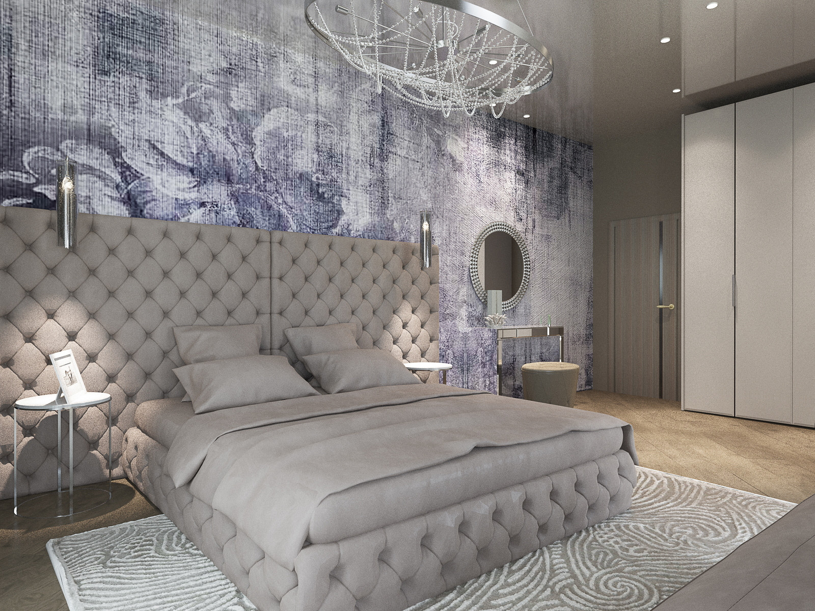
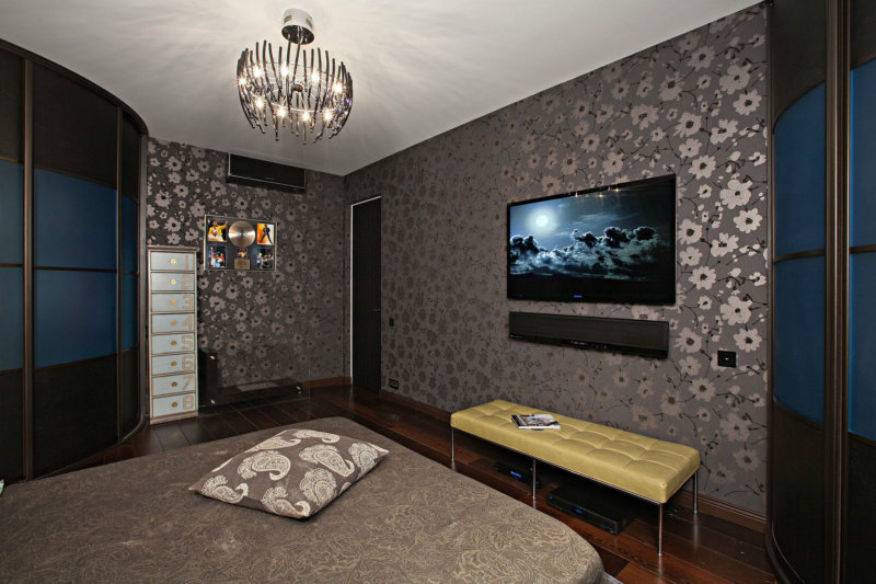
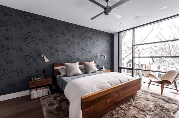
- Cool and fresh gray interior design.
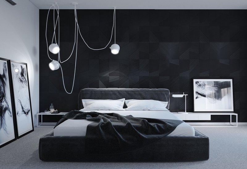
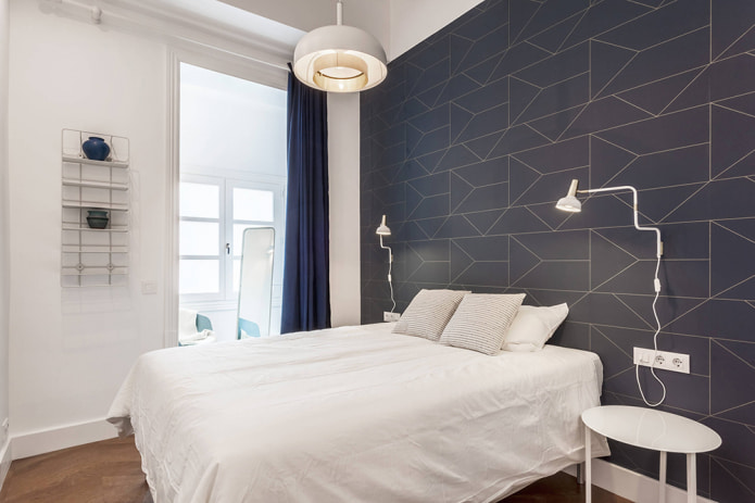
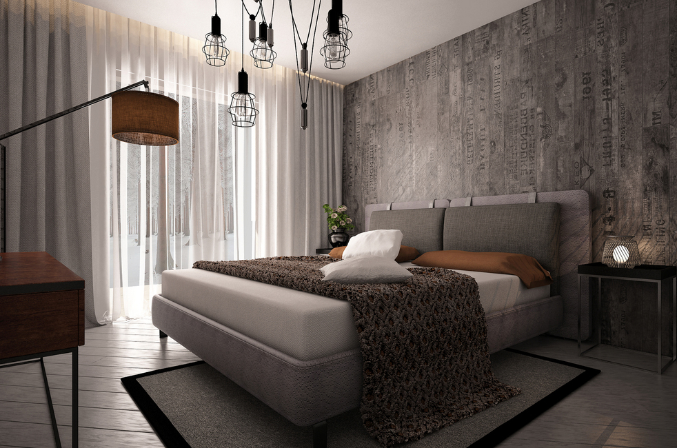
- Scandinavian bedroom with graphite accent wall.
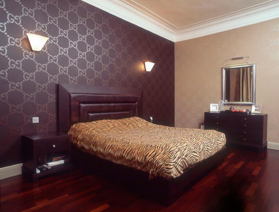
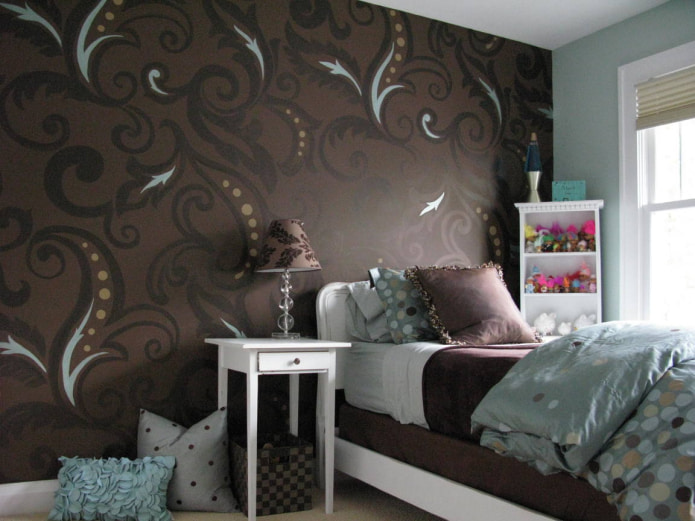
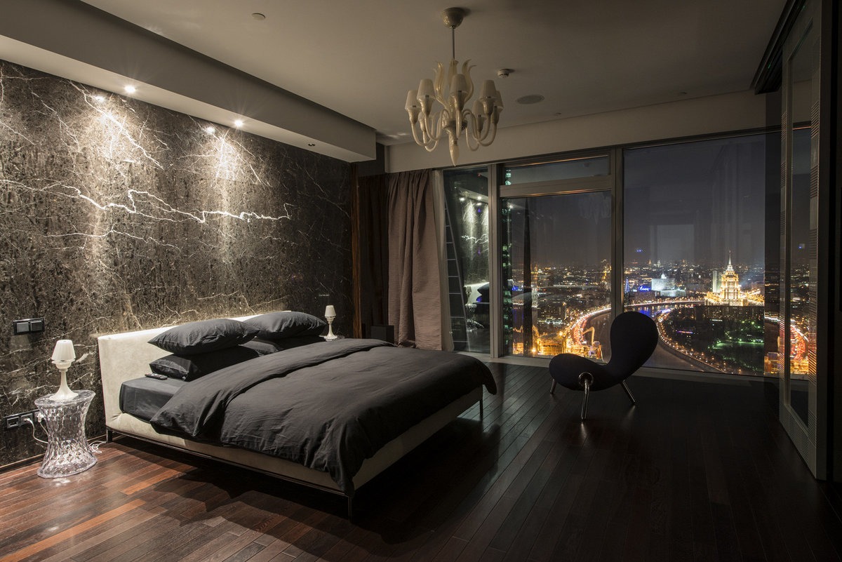
- Luxurious room with dark brown trim.
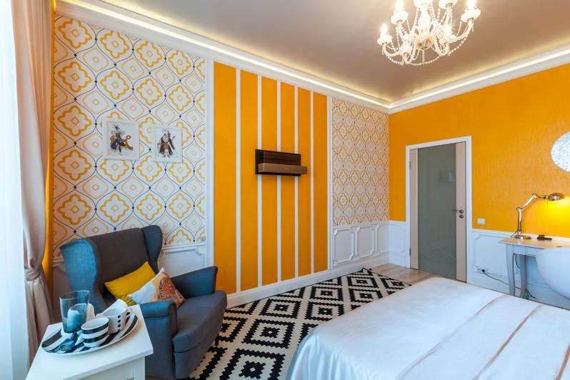
- Bright colored eco-style interior. Suitable for nature lovers.
- Emerald bedroom. It looks impressive and noble.
- The interior is predominantly blue. The room looks fresh and cool.
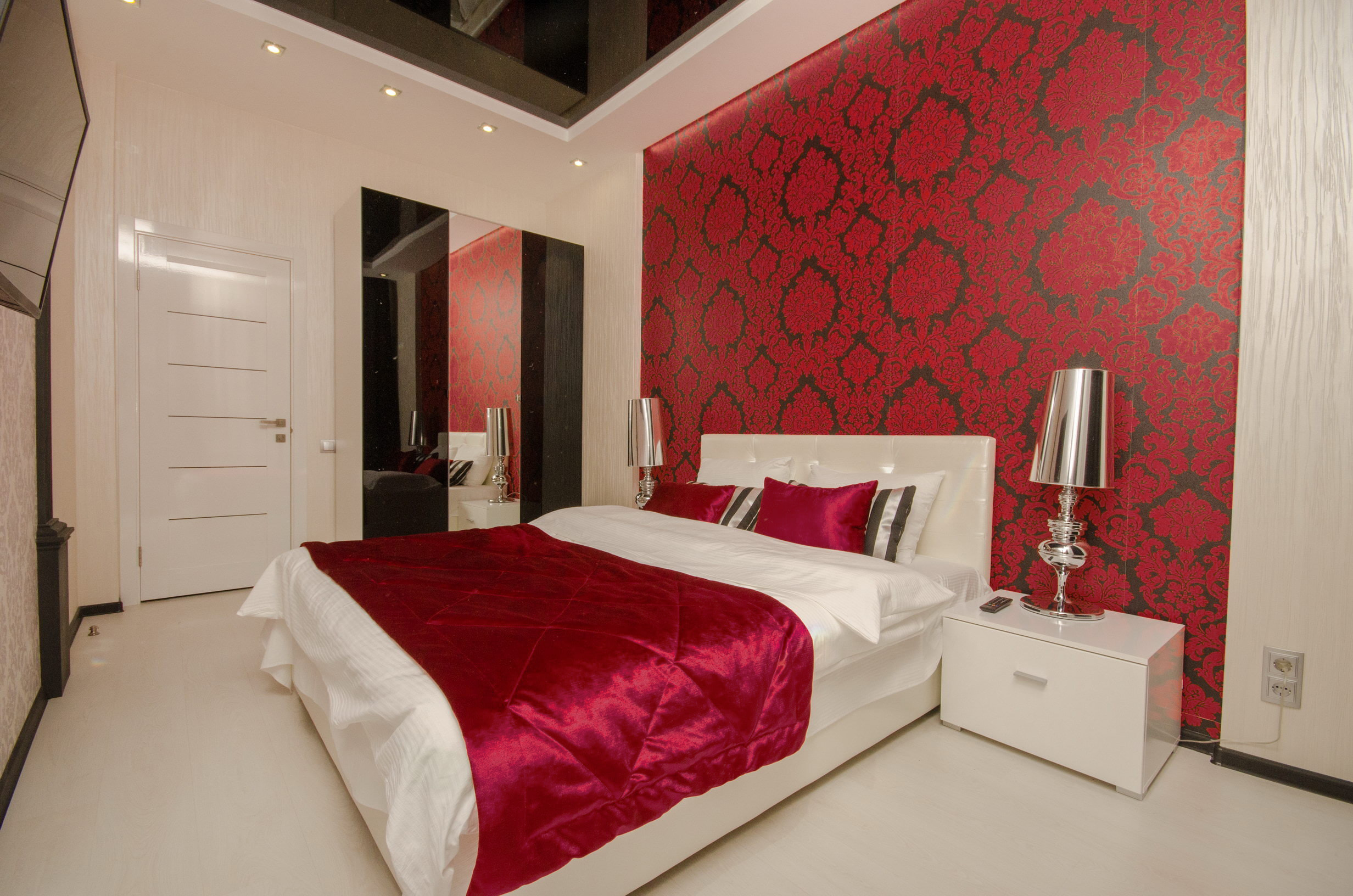
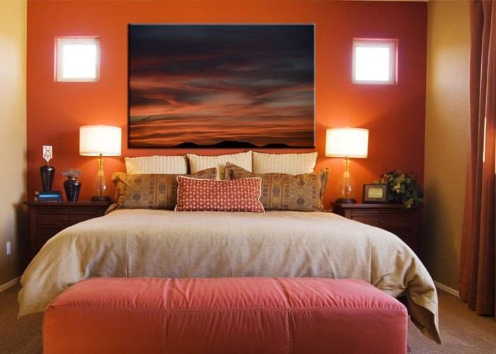
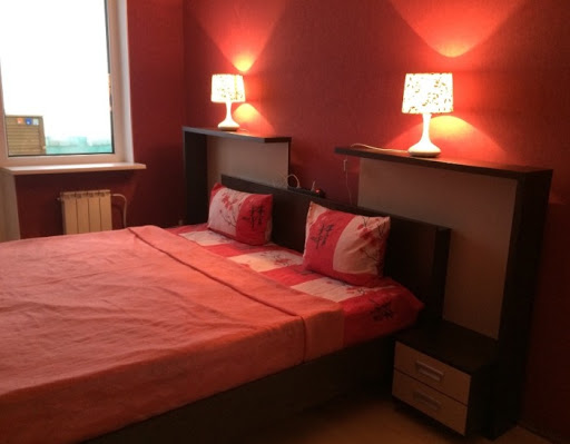
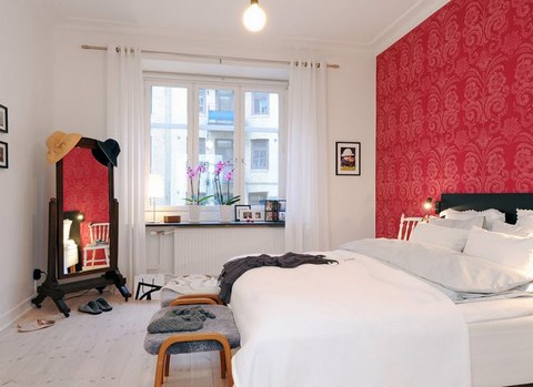
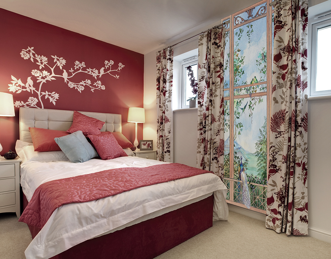
- Bedroom design with accent red wall.